


![How to Use the 2022 Pantone Color of the Year [Very Peri] in Your Wedding-Koyal Wholesale](http://www.koyalwholesale.com/cdn/shop/articles/how-to-use-the-2022-pantone-color-of-the-year-very-peri-in-your-wedding_1024x683.jpg?v=1743595809)
How to Use the 2022 Pantone Color of the Year [Very Peri] in Your Wedding
Looking for color inspiration for your wedding? Look no further than Pantone’s color of the year! In 2022, that happens to be a shade called Very Peri. It’s the first shade that was specifically created by Pantone to be the color of the year. With its violet undertones, it strikes the perfect balance between calm serenity and electric creativity.
The question is, exactly how do you integrate Very Peri into your wedding day? We want to stretch your imagination and show you that Very Peri can create the perfect mood at your wedding when it is paired with the right shade of every color in the rainbow.

Bridesmaids in Periwinkle Holding Bright Pink Bouquets: Style Me Pretty, Very Peri and Light Pink Invitation Suite: Wedding Chicks
Red
When combining red with Very Peri, avoid true red and stick to extremes instead. For example, shades of light pink combined with this periwinkle shade would be perfect for a spring wedding. It can also give any celebration a feminine touch.
If you want a color combination with more of an edge for a summer wedding, stick with vibrant pinks, red-violets, and fuchsia. Combining bright pinks with Very Peri and shades of green is a fresh take on a tropical vibe.

Wedding Cake With Painted Periwinkle Flowers Decorated With Oranges: Lea Ann Belter, Periwinkle and Orange Flower Arrangement: Inside Weddings
Orange
Orange probably isn’t what first comes to mind when you consider colors to pair with Very Peri, but because blue and orange are opposites on the color wheel, they make a great pair. Which hue you choose will depend on when your wedding is taking place and the vibe you want to create on your big day.
True orange is a surprising pick. It's one your guests won't expect, making it perfect for couples who love the element of surprise. The darker the shade of orange, the more your color palette will feel like fall, while the lightest shades of peach are a great pick for spring and summer weddings.

Blue Thistle and Billy Ball Wedding Bouquet: Rustic Wedding Chic, Bright Yellow and Periwinkle Blue Reception Table: Inspired By This
Yellow
Very Peri is a little bit blue, which means orange is its opposite on the color wheel, but it’s also a little bit purple, which means yellow is a great choice too!
Because purple and yellow are opposite on the color wheel, choosing yellow follows the same rules as choosing orange. The brightest shades of yellow are perfect for cheerful couples who want unabashed joy to be the theme of the day. The lightest shades of buttercup make Very Peri feel like spring, while the darkest shades of honey can bring your color palette into the fall.

Blue and Green Bridal Bouquet: Brides Up North, Periwinkle, Green, and White Flower Arch: The Wedding of My Dreams
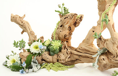
Green
Green is a popular wedding color with eco-conscious brides and grooms, but it’s also a striking choice when combined with Very Peri. Keep your color choices as natural as possible when making this color combination come alive. It’s at its most sophisticated when you choose dark, ashy, or glossy greens. Tread carefully when it comes to shades of lime. Incorporate other colors as well to give your palette a more refined look.

All Blue Table Setting with Flowers and Hobnail Goblets: Style Me Pretty, Bride and Groom Walking Down the Aisle Surrounded by Blue Flowers: The Knot
Blue
Choosing blue means moving into the cooler portion of the color wheel. This hue will give your wedding a relaxed, less energetic vibe than the warm colors on the color wheel. Because Very Peri is also a warm color, a color palette with shades of blue can imbibe a sense of tranquility at your wedding.
The darkest blues are perfect for a black tie affair, while shades of teal are perfect for beach weddings. True blues and Very Peri can make a color palette feel like it came from the bargain bin, so combine them with multiple shades of blue to create a more dynamic color combination.

Blue and Purple Hydrangea Cupcakes: Glorious Treats , Plum Flower Arrangement and Very Peri Table Décor: Southbound Bride
Purple
Easing into purples is a natural choice if you decide you want to use Very Peri at your wedding, especially if you’re having trouble deciding which other colors to use. Medium shades of purple will give your wedding a monochromatic look. Choosing lilac shades can give your wedding an English garden feel, while dark shades of plum can help you transition your palette to winter.

Black Dress With Lighted Blue Tree in the Background: The Ever Pretty Blog
Neutrals
Don’t forget about neutrals! Shades of white, gray, brown, and black look great with every color, including Very Peri, but which you choose will give your wedding a totally different vibe.
Shades of tan, taupe, and brown with Very Peri can give your wedding a boho vibe, while shades of crisp white and inky black are perfect for nighttime nuptials and upscale celebrations.
Want even more color inspiration? Check out some of our favorite color combinations straight from Pantone, or take a look at some of the color combinations we created that have been inspired by Very Peri.